Vue A11y Utils
Utilities for accessibility (a11y) in Vue.js
Table of Contents
- Why
- Getting Started
<VueAria>Componentv-ariaCustome DirectiveTravelMixinIdMixin<VueFocusTrap>ComponentShortcutsMixin<VueLive>Component- Further resources
Why
TL;DR: when you write a Vue app with full accessibility, you may meet some common issues to deal with. So we built this project to help you.
Background
As the (WIP) Vue accessibility guide page says:
The World Health Organization estimate that 15% of the world's population has some form of disability, 2-4% of them severely so ... which can be divided roughly into four categories: visual impairments, motor impairments, hearing impairments and cognitive impairments.
table: issues for different impairments
| visual | motor | hearing | cognitive |
|---|---|---|---|
| 🖥 🔎 🎨 | 🖱 📱 ⌨️ 🕹 🎮 🎙 🖊 🎛 | 🔈 | content, layout, interaction |
Or there are also some accessibility issues for a normal person in such a situation like driving a car, having a meeting, using a mobile device with a bluetooth keyboard etc.
So actually accessibility is not just for the "less amount of people", but for almost everyone.
But some mistakes we often make in a real project like:
- Mouse-only in a desktop app
- Touch-only in a mobile app
- Remote-control-only in a TV app
- Operation through keyboard only is not possible or with low efficiency
- No text alternative for non-text content
- Have no fallback way for the creative interaction like e-pencil, audio input, face ID, touch ID, NFC etc.
- The color contrast is not enough
Each of them might make user confused, block the user flow or lead user to a no-way-out trap in some certain cases.
Web Standards
However, there are already some web standards and best practice to follow which let developers do it better.
In W3C there are 3 main parts of accessibility standards:
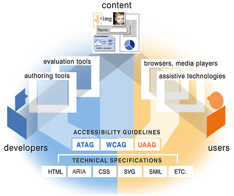
via: W3C Accessibility Standards Overview
- WCAG: about web content, targeting websites.
- UAAG: about user agent, targeting browsers, screen readers etc.
- ATAG: about authoring tools, targeting CMS, WYSIWYG editor etc.
and a technical spec which is commonly used:
- WAI-ARIA: targeting web app.
For web developers, we may pay more attention on WCAG and WAI-ARIA. At the same time, we should know which user agents people use most and how about their support and compatibility to the standard.
Here is a survey about most common screen reader and browser combinations table:
| Screen Reader & Browser | # of Respondents | % of Respondents |
|---|---|---|
| JAWS with Internet Explorer | 424 | 24.7% |
| NVDA with Firefox | 405 | 23.6% |
| JAWS with Firefox | 260 | 15.1% |
| VoiceOver with Safari | 172 | 10.0% |
| JAWS with Chrome | 112 | 6.5% |
| NVDA with Chrome | 102 | 5.9% |
| NVDA with IE | 40 | 2.3% |
| VoiceOver with Chrome | 24 | 1.4% |
| Other combinations | 180 | 10.5% |
via Screen Reader User Survey by webaim.org
Common Issues
When you write a Vue app with full accessibility. You may meet some issues frequently. For example:
- Making sure the W3C WAI-ARIA roles & properties of each DOM element are set properly.
- Controling the focus and finish every use case elegantly only through keyboard.
- Using a central live region to read messages right now in a screen reader.
- Sometimes you need set a ID reference or ID reference list type aria attribute with ID of another DOM element. But we don't use ID in Vue to identify a DOM element right?
So that's why Vue A11y Utils is trying to supply a group of utilities to help Vue developers finish these jobs easier.
Getting Started
This guide is for Vue 3.x. If you are using Vue 2.x, please refer to this doc.
Install
npm install vue-a11y-utils
or
yarn add vue-a11y-utils
or
pnpm install vue-a11y-utils
Import
// choose the utils you need
import {
  ariaToAttrs,
  getTabindexByRole,
  Live,
  useLive,
  FocusTrap,
  genId,
  useTravel,
  useHotkey,
  useGlobalHotkey,
} from "vue-a11y-utils";
Usage
See the docs below or preview some examples online.
For more complicated examples, there is another repo in Jinjiang/vue-a11y-examples you can preview online. (currently based on v0.8.x and below)
Keyboard travel utils
We provide a composable named useTravel(config) to help you use Arrow keys to travel through a group of focusable items or descendants. At the same time we support you fire some common actions by pressing ENTER, SPACE or ESC key.
About the config, it accepts a Ref of current index and a Ref of the items to track them.
For traveling, it accepts a onMove() function which would be fired when the index changes by Arrow keys.
For user interactions, it also accepts onEnter(), onSpace(), and onEsc(). They would be fired when users press the corresponding keys down. As a shortcut, onAction() is also accepted for both ENTER and SPACE keys.
For example:
import { TravelConfig, useTravel } from "vue-a11y-utils";

const items = ref<HTMLElement[]>([]);
const index = ref(-1);
const output = ref("");

const travelOption: TravelConfig = {
  itemsex,
  : (_: KeyboardEvent, newIndex) => {
    ivalue = newIndex;
   value[newIndex].focus();
  }, (_: KeyboardEvent, index) => {
    output.value = options[index].value;
  },
};

const bindTravel = useTravel(travelOption);
at the same time, set the template as:
<ul @keydown="bindTravel">
  <li
    v-for="option in options"
    :key="option.value"
    ref="items"
    :class="{ current: option.value === value }"
  >
    {{ option.text }}
  </li>
</ul>
<p>Output: {{ output }}</p>
See the full example in file ./examples/travel.vue.
Advanced config
orientation: "horizontal" | "vertical": which pair of Arrow keys would be listened. The default value is"vertical"as ArrowUp and ArrowDown.loop: Boolean: whether the travel is in loop mode.supportTyping: BooleanandonType(): customize the support of quick positioning to a certain item by typing its letters.supportPagination: BooleanandonNextPage()/onPrevPage(): customize the support of PageUp and PageDown.
The full type declaration is below:
type TravelHandler = <T>(
  event: KeyboardEvent,
  rawIndex: number,
  rawItems: T[]
) => boolean | void;

type TravelConfig<T> = {
  index: Ref<number>;
  items: Ref<T[]>;

  orientation?: string;
  loop?: boolean;

  onAction?: TravelHandler;
  onEnter?: TravelHandler;
  onSpace?: TravelHandler;
  onEsc?: TravelHandler;

  onMove?(
    event: KeyboardEvent,
    rawIndex: number,
    oldRawIndex: number,
    rawItems: T[]
  ): boolean | void;

  supportTyping?: boolean;
  onType?(
    event: KeyboardEvent,
    keyword: string,
    rawIndex: number,
    rawItems: T[]
  ): boolean | void;

  supportPagination?: boolean;
  onNextPage?: TravelHandler;
  onPrevPage?: TravelHandler;
};

const useTravel = <T>(
  config: TravelConfig<T>
): ((event: KeyboardEvent) => void)
Hotkey utils
We provide a composable named useHotkey(config) which returns a handler for hotkey bindings.
The config accepts a key, a key combination, a sequence of keys to handle, or an array of them above. At the same time, it accepts a handler.
The return value of this composable is a event handler that you can bind into a certain element in your Vue template.
For example:
import { HotkeyConfig, useHotkey } from "vue-a11y-utils";

const config: HotkeyConfig = {
  key: "g",
  modifiers: { meta: true },
  handler() {
    alert("trigger: CMD + G");
  },
};

const bindHotkey = useHotkey(config);
at the same time, set the template as:
<input type="text" value="CMD + G HERE" @keydown="bindHotkey" />
We also provide another composable named useGlobalHotkey(config), the only difference from useHotkey(config) is it doesn't return any event handler to bind because the event handler will be automatically attached on the document when the component is mounted, and unattached when the component is unmounted.
For example:
import { useGlobalHotkey } from "vue-a11y-utils";

useGlobalHotkey({
  key: "a",
  modifiers: { ctrl: true },
  handler() {
    alert("CTRL + A");
  },
});
Advanced config
You can set a sequence of keys like:
useGlobalHotkey({
  keys: ["a", "s", "d", "f"],
  handler() {
    alert("You have pressed A-S-D-F. So are you boring now?");
  },
});
You can set multiple hotkeys in an array like:
useGlobalHotkey([
  {
    key: "g",
    modifiers: { meta: true },
    handler() {
      alert("wrapper trigger: CMD + G");
    },
  },
  {
    key: "k",
    modifiers: { meta: true },
    handler() {
      alert("wrapper trigger: CMD + K");
    },
  },
]);
For key name, it can be:
a-z0-9up|down|left|right|home|end|pagedown|pageup- other
codein aKeyboardEvent
For key modifiers, it can be:
ctrlshiftalt|optioncmd|meta|window
The full type declaration is below:
export type KeyModifiers = {
  ctrl?: boolean;
  shift?: boolean;
  alt?: boolean;
  meta?: boolean;
  window?: boolean;
  cmd?: boolean;
  option?: boolean;
};

export type KeyDescriptor = {
  key: string;
  modifiers?: KeyModifiers;
};

export type SingleHotkeyConfig = {
  handler: (event: KeyboardEvent) => boolean | void;
} & KeyDescriptor;

export type MultipleHotkeyConfig = {
  handler: (event: KeyboardEvent) => boolean | void;
  keys: Array<KeyDescriptor | string>;
};

export type HotkeyConfig =
  | SingleHotkeyConfig
  | MultipleHotkeyConfig
  | Array<SingleHotkeyConfig | MultipleHotkeyConfig>;

const useHotkey = (config: HotkeyConfig): ((event: KeyboardEvent) => void)

const useGlobalHotkey = (config: HotkeyConfig): void
See the full example in file ./examples/hotkey.vue.
Focus trap utils
Usually, when you have a modal dialog in your Vue app, you should keep the focus always in it whatever you navigate by touch, mouse or keyboard.
<FocusTrap> gives you a easy way to wrap a modal content in a focus trap which supports two events: gofirst and golast, which is able to reset the focus to the first or the last focusable element in it.
But there must always be at most one focus in the whole Vue app, so by default all the <FocusTrap> instances would be disabled by default. To move the focus from one trap to another, you need instance methods:
open(): enable the current focus trap and push the previous focus trap in an "focus stack" internally. At the same time, save the previous focused element, and then emit aopenevent.replace(): enable the current focus trap and replace the last focus trap in the "focus stack" with the current one. At the same time, save the previous focused element, and then emit aopenevent.close(returnFocus): disable the current focus trap and enable the last focus trap in the "focus stack". Also you can determine whether auto-focus the previous focused element in that focus trap. And then emit aopen(prevTraget)event with the previous focused element whatever you determined.
For example:
In this example below, after you open the modal dialog by click the trigger button, the focus will always be in one of the 4 control elements in <form>, whatever you press tab, tab + shift or click somewhere out of the dialog:
<template>
  <div>
    <button ref="trigger" @click="shown = true">Open a Modal Dialog</button>
    <form class="dialog" v-show="shown">
      <FocusTrap ref="dialog" @open="open" @gofirst="goFirst" @golast="goLast">
        <label>Email: <input ref="email" type="email" /></label>
        <label>Password: <input ref="password" type="password" /></label>
        <button ref="login" @click="shown = false">Login</button>
        <button ref="cancel" @click="shown = false">Cancel</button>
      </FocusTrap>
    </form>
  </div>
</template>

<script setup>
import { onMounted, ref, watch } from "vue";
import { FocusTrap } from "vue-a11y-utils";

const trigger = ref();
const dialog = ref();
const email = ref();
const password = ref();
const login = ref();
const cancel = ref();

const shown = ref(false);

const goFirst = (): void => {
  email.value?.focus();
};
const goLast = (): void => {
  cancel.value?.focus();
};

onMounted(() => {
  trigger.value?.focus();
});

watch(shown, (value) => {
  if (value) {
    setTimeout(() => {
      dialog.value?.open();
    }, 100);
  } else {
    dialog.value?.close(true);
  }
});
</script>
TIP
Notice that for browser compatibility, please take an about >50ms timeout before focus the modal dialog after its v-if or v-show directive set truthy.
Methods
open()replace()close(returnFocus: boolean)
Slots
- default slot: the content you would trap focus in.
Events
open(prevTarget: HTMLElement | null): when it is enabledgofirst(): when you should manually set focus to the first focusable elementgolast(): when you should manually set focus to the last focusable element
See the full example in file ./examples/focus-trap.vue.
Id utils
useId(content?: string): returns a local ID for template.
In modern web framework today, the id attribute of an HTML element is almost never used. But in WAI-ARIA, some aria-* attributes like aria-controls, aria-labelledby only accept ID reference or ID reference list. Another problem about id is that it's always global unique. But every Vue component has its own scope. It's not easy to make sure an id not used in other Vue components.
This composable helps you generate unique id (sometimes as an id prefix) for HTML elements in a component by default. And you can also easily specify the id manually if necessary.
For example:
custom-input.vue:
<template>
  <div :id="localId">
    <label :id="`${localId}-label`">{{ label }}</label>
    <input
      type="text"
      :id="`${localId}-input`"
      :aria-labelledby="`${localId}-label`"
    />
  </div>
</template>

<script setup lang="ts">
import { genId } from "vue-a11y-utils";

const { id } = defineProps<{
  id?: string;
}>();

const localId = genId(id);
</script>
the localId is a string which is generated by useId(). And it would be globally unique if you don't pass anything in. So you don't have to worry about that.
If you have a form with a group of inputs, it is suitable for set each input with a different auto-generated id in that way above.
You can also specify an ID from outside.
For example:
<template>
  <div>
    <CustomInput id="foo" />
    <button aria-controls="foo-input">Clear</button>
  </div>
</template>
Then the final generated DOM tree will be:
<div>
  <div id="foo">
    <label id="foo-label">Username</label>
    <input id="foo-input" aria-labelledby="foo-label" />
  </div>
  <button aria-controls="foo-input">Clear</button>
</div>
See the full example in file ./examples/id.vue and ./examples/id-input.vue.
Aria utils
We provide some composables to help you write, tabindex, role and aria-* attributes likely in a better way.
First you could put all aria-* attributes in an JS object. Second, it's more portable to use.
Another thing important is the tabindex attribute which could make an element focusable. But sometimes when the role changed into "none" or "appearance", there should be a easy way to remove them from the TAB sequence as well.
For example:
<template>
  <label>
    <input type="checkbox" v-model="enabled" />
    enable the form
  </label>
  <Icon v-bind="attrs" />
</template>

<script setup>
import { ariaToAttrs } from "vue-a11y-utils";
const enabled = ref(false);
const attrs = computed(() => {
  return ariaToAttrs(
    { label: "submit the form" },
    enabled.value ? "button" : "none",
    0
  );
});
</script>
We also provide another simple composable named getTabindexByRole(tabindex: number | undefined, role?: string) => string to return a proper tabindex according to the given role. If the role is "none" or "appearance", the returned tabindex would be -1.
See the full example in file ./examples/aria.vue.
Live utils
inspired from react-aria-live by AlmeroSteyn
This component is actually a wrapper which generates a invisible WAI-ARIA live region and provides a default slot which injects some methods to announce live messages on its descendant components.
For example:
App.vue:vue<template> <VueLive> <Foo /> </VueLive> </template> <script setup> import { VueLive } from "vue-a11y-utils"; </script>Foo.vue:vue<template> <div> Message: <input type="text" v-model="message" /> <button @click="announce(message)">Announce</button> </div> </template> <script setup> import { ref } from "vue"; import { useLive } from "vue-a11y-utils"; const message = ref(""); const [announce] = useLive(); </script>
Now, if you enable VoiceOver or other a11y screen readers, there will be a live message announced when you input some text in the textbox and press the "announce" button.
The injected method announce(message) could announce live message to the screen reader.
But by default the live message will be announced "politely" after other voices spoken. If you want to announce the message immediately, you can pass a second parameter with a truthy value:
<template>
  <div>
    Message: <input type="text" v-model="message" />
    <input type="checkbox" v-model="immediately" />: immediately
    <button @click="announce(message, immediately)">Announce</button>
  </div>
</template>

<script setup>
import { ref } from "vue";
import { useLive } from "vue-a11y-utils";
const message = ref("");
const immediately = ref(false);
const [announce] = useLive();
</script>
Props
role: string:"log"by default, you can also choose other live region roleslabel: string: the label of the live region
Slots
- default slot: the content you would wrap.
useLive()
It returns 2 methods in sequence:
announce(message: string, immediately: boolean): announce message to screen readermessage: the message text would be announcedimmediately: whether announce immediately or "politely"
isBusy(busy: boolean)if you set ittrue, only the last message you send during that time would be announced after you set itfalselater. (experimental, not sure screen readers support that well)
See the full example in file ./examples/live.vue.